Scale Multiple Objects
Coordinate the scaling of multiple objects, and learn some visual tricks while animating the Github logo.
First…
Layout in Sketch.
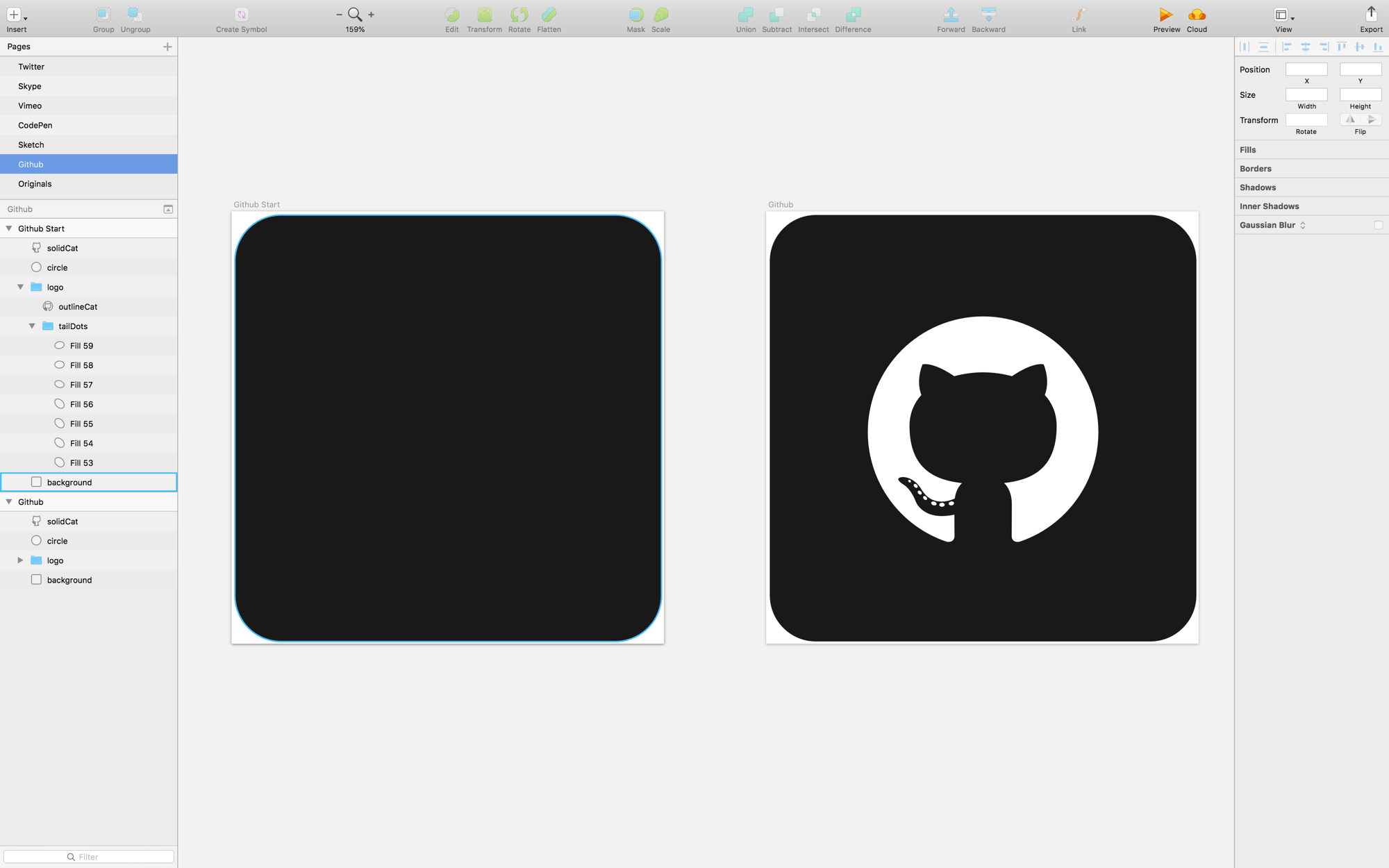
On the Github page in icons.sketch, you’ll see two artboards. On the left is the start state and the right is the final state.

Trix
To achieve the effect we’re looking for, we need to use different layers of the same “logo.” For example, I had to cut out and reshape the cat layer so that I could position it over top of a solid circle.

Create a Flow File
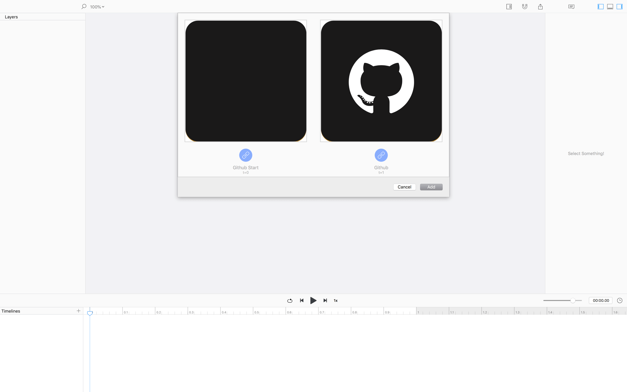
Create a Flow file by adding the Dribbble artboard at both t0 and t1.

Since we used the same artboard for the start and end states, there is no initial animation in Flow.
Animate!
Let’s clean up and get started.
The circle
- Set the
xproperty at1.0sto187.5(i.e. half the width of the scene) - Delete the other
xkeyvalue to remove the animation - Drag the
widthandheightkeyvalues from0.0sto0.25s - Press option+⬅︎ to snap the playhead to those keyvalues.
- Select
circleand align it to the top oflogo - At
1.0sgraby,widthandheight, then drag them to0.5s - Change all the easing values to
Ease Out - Move the first keyvalue of the opacity track to
0.64sand set the easing toStep Left
The solidCat
- Delete the first keyvalue of the
xtrack - Change the
ytrack to animate from0.35sto0.65s - Make the
ytrack easingEase Out - Change the
opacityeasing value toStep Right -
Drag the last
opacitykeyvalue to0.65“What are all these steps?” You wonder. Well, you can think of them as moments where there are no animations. Then, the property snaps to the next value.
Logo
- Drag the first
opacitykeyvalue to0.51s, and make the easingStep Left - Grab the first keyvalue of the
tailDotsgroup and drag it to0.9s - Stagger all the layers in the
tailDotsgroup - Move the first fill layer’s animation so that it starts at
0.67s - Distribute-left all the fill layers.
NOW HIT PLAY!
❤︎