Key Concepts for Launch Animations
Alright, you've got a great animation that you want to use for the launch of your app. Before you share it with a developer, there are a couple of key concepts you should learn.
The Three Launch Views
A launch animation iOS app has 3 main views / components to it:
- The launch screen view
- The animation view
- The first view of the app
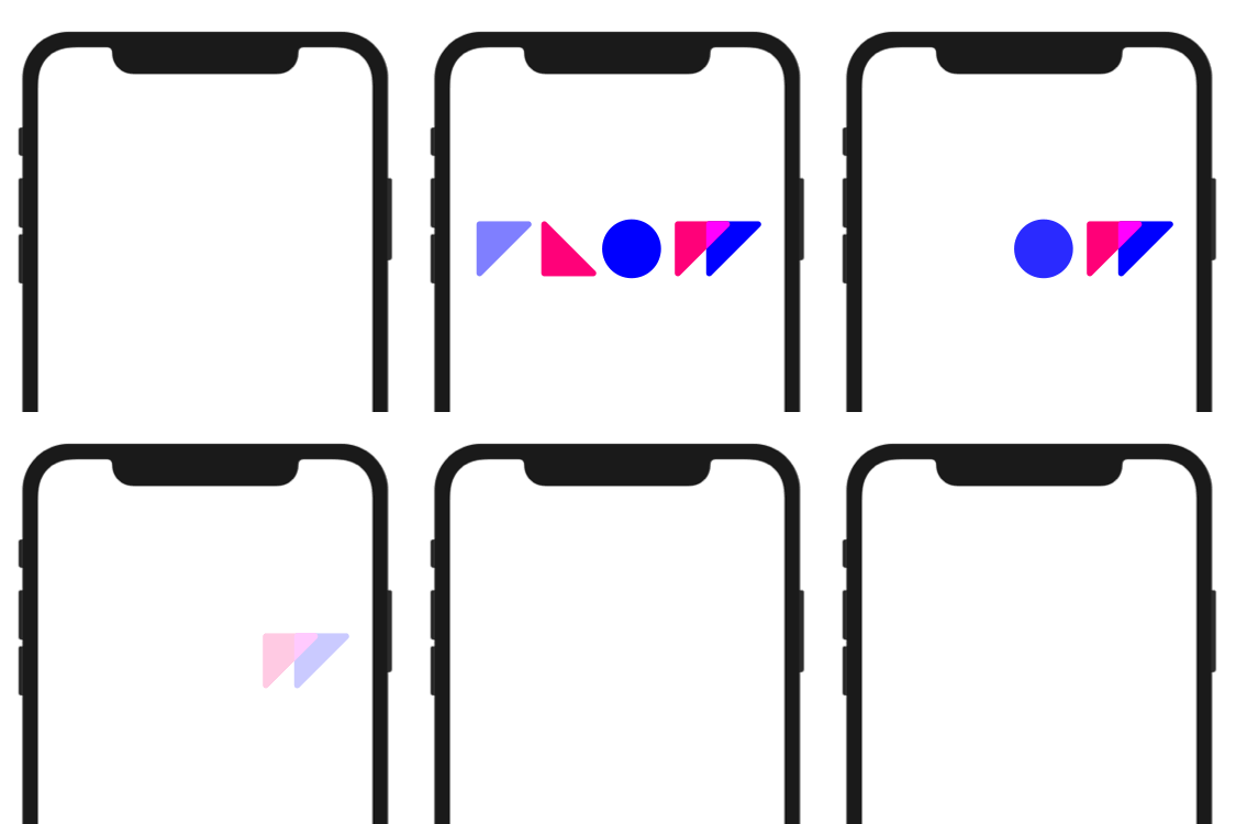
Launch Sequence
A launch animation starts directly from the app icon. Let’s analyze the standard launch animation for an Flow iOS export.
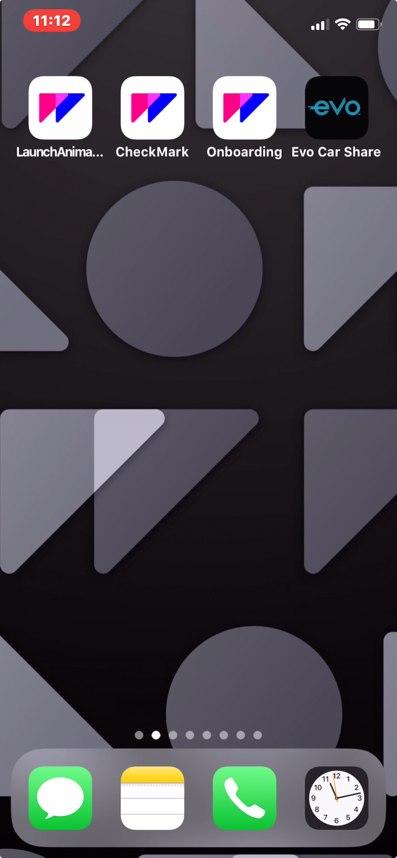
After tapping the icon, the launch screen “image” grows until it takes up the full view of the device.
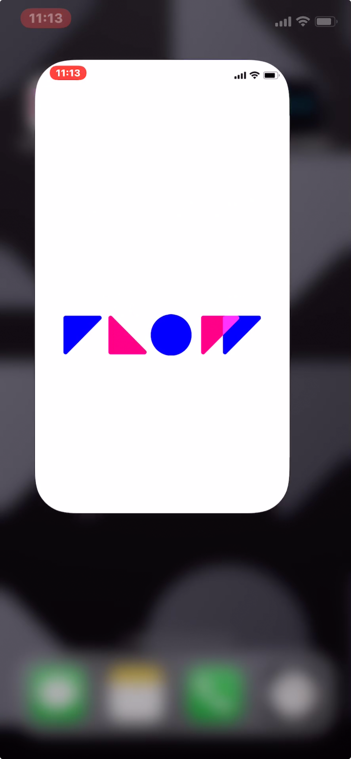
Launch animations actually start JUST BEFORE the launch animation fills the view of the device.
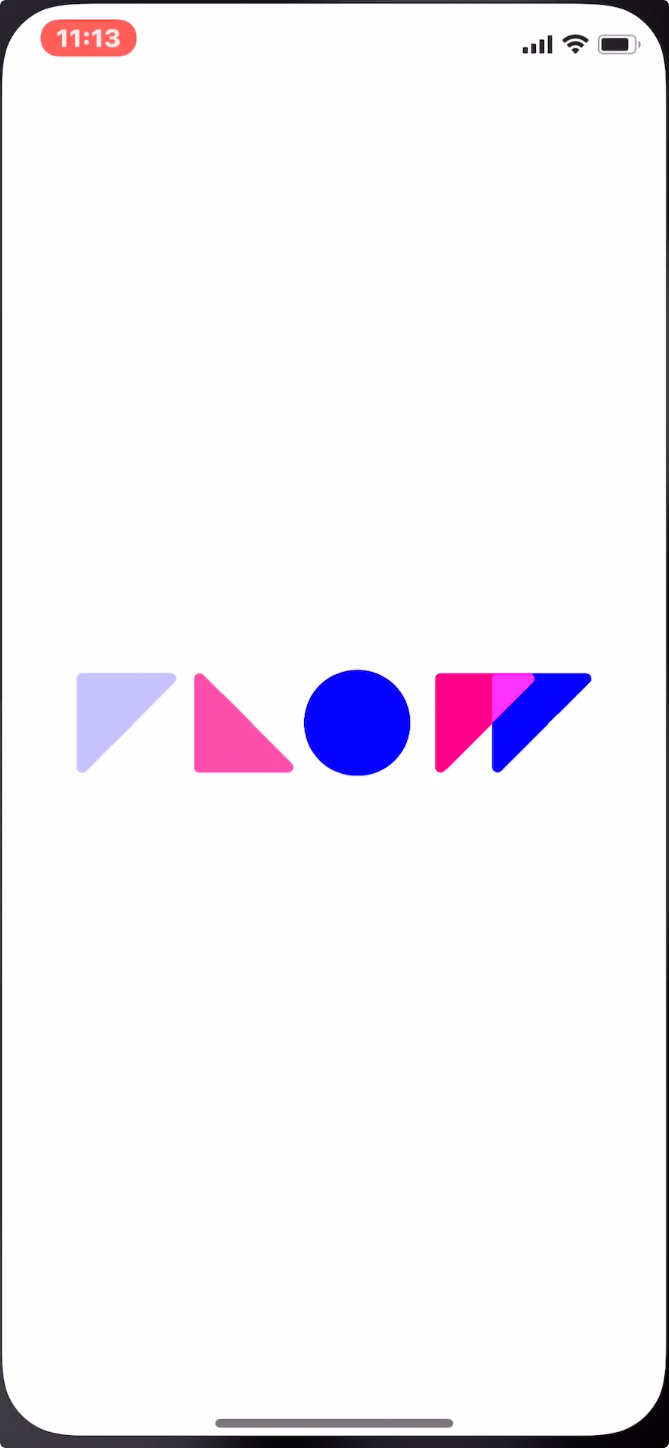
When the animation completes, the animation view fades to the first view of the app.

Evo Animation Breakdown
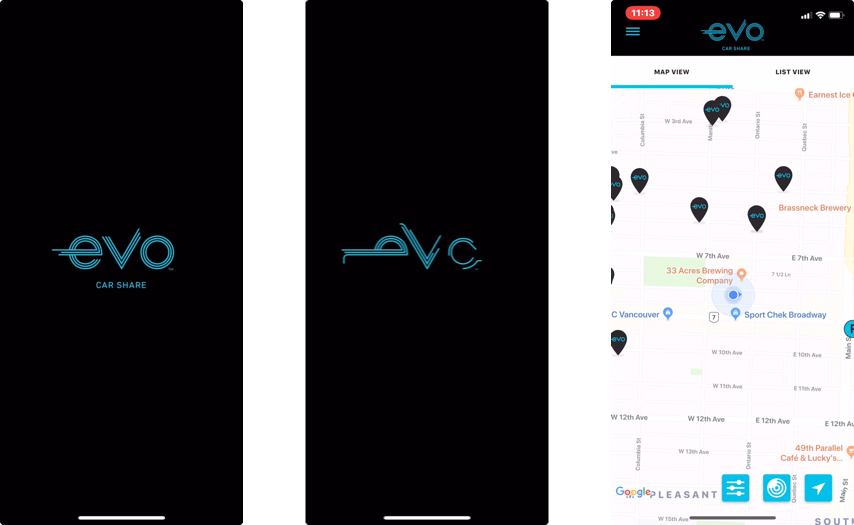
The Evo carshare app has a fantastic animation, here’s a look at it in glorious looping detail.
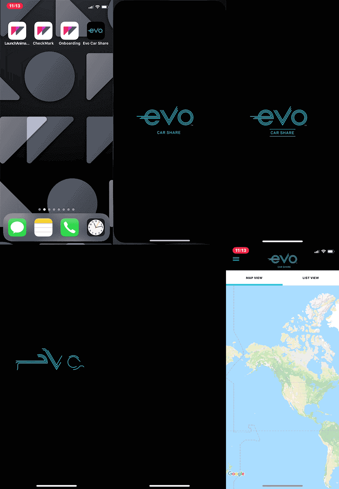
Let’s have a look at the animation in more detail.
Things to note:
- The launch screen looks just like the first frame of the animation
- The animation takes about 1.25s
- There is an offset between the launch screen and the first frame, causing a slight shift as the app transitions to the animation view.
- Total time from tapping the app icon, to the app loaded is ~3.25s
The Smallest Screen
Our suggestion is to design your launch animations to fit the smallest screen your on which your app will be available.
If you don’t, there’s a good possibility your animation might get clipped.
For example, let’s say you’ve started with an artboard that fits an iPhone 8 Plus:
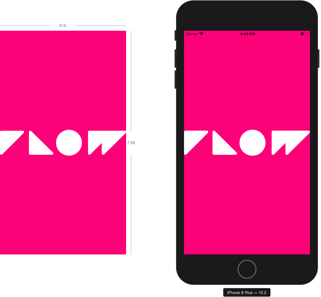
Now… the same animation will be clipped if it is run on any of the following devices:
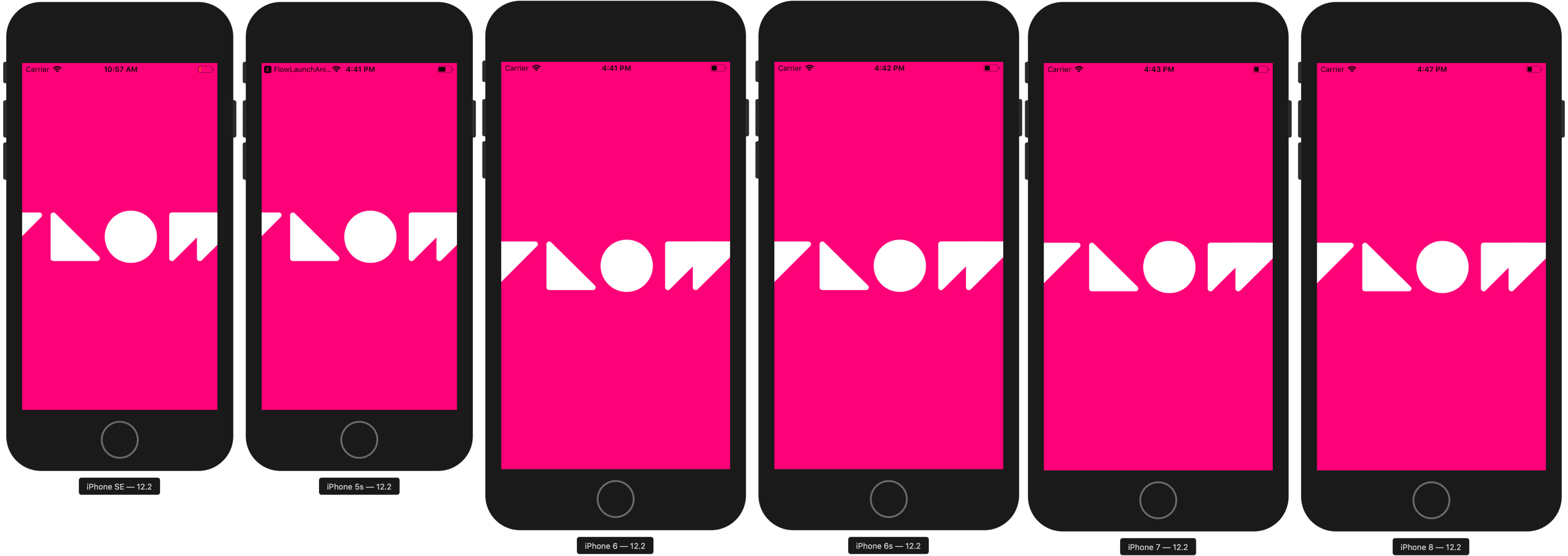
Apple recently phased out production of the 5/SE, 6, and X iPhone models… So there should be a bunch of those kicking around for the next few years.
Contain Your Animation
Following from the previous point, you should contain your animation within the smallest frame that you are designing for.
This is important when your launch animation is available on larger devices.
Let’s say you’ve created a launch animation for an iPhone SE screen size, with something coming in from the left…
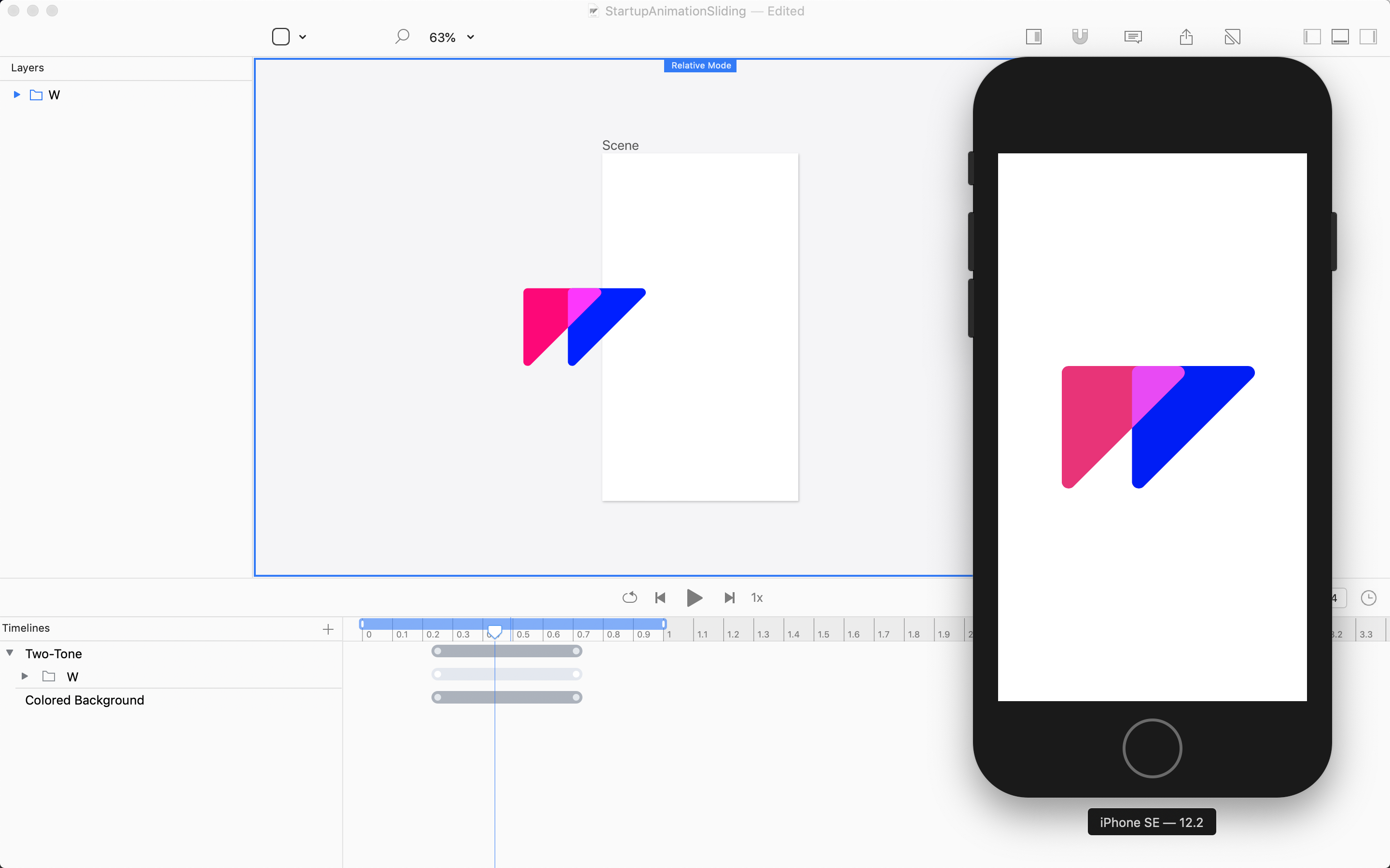
This will look great on an iPhone SE.
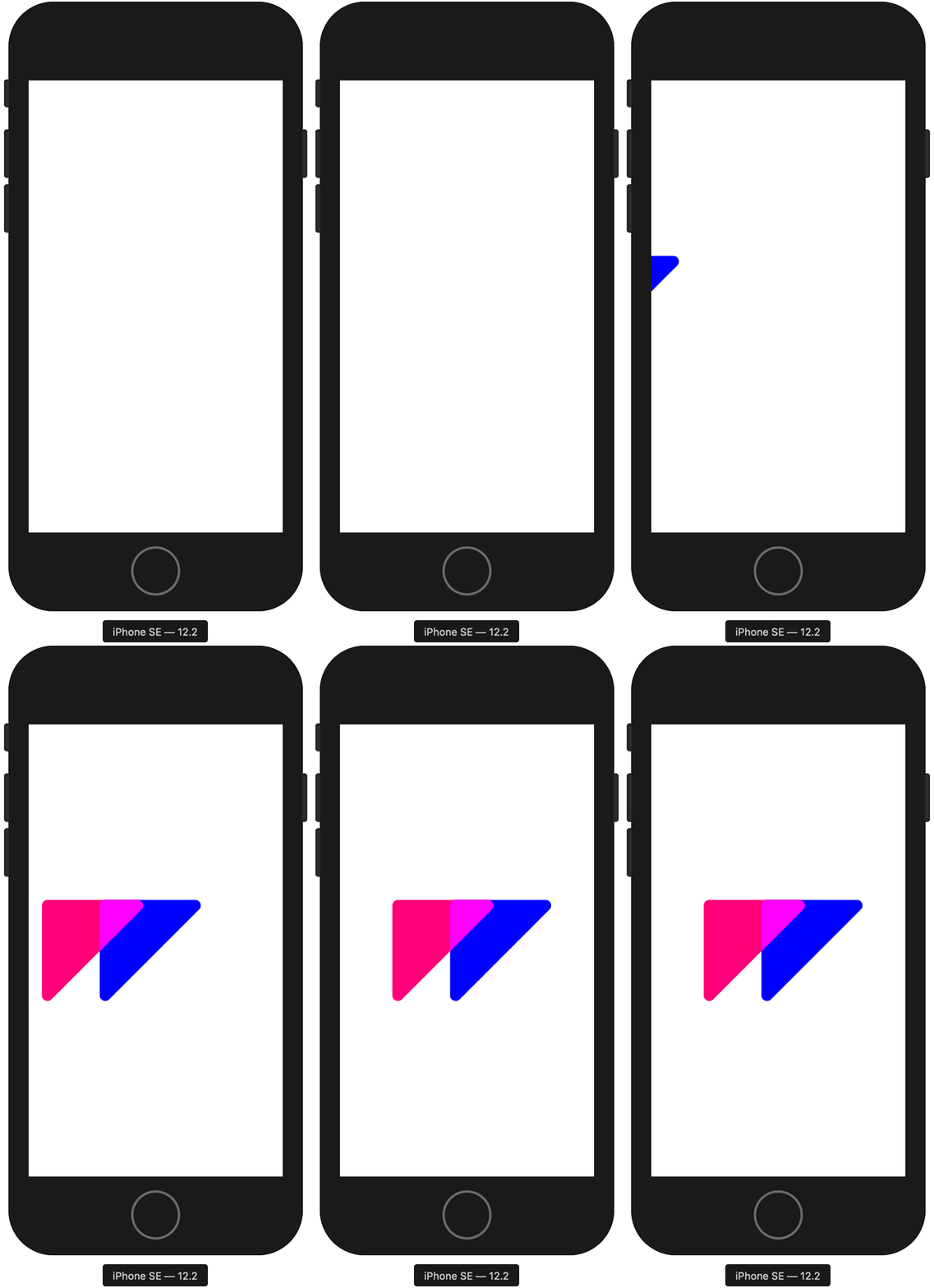
However, on any larger device, this animaiton will be clipped to the edge of the artboard…
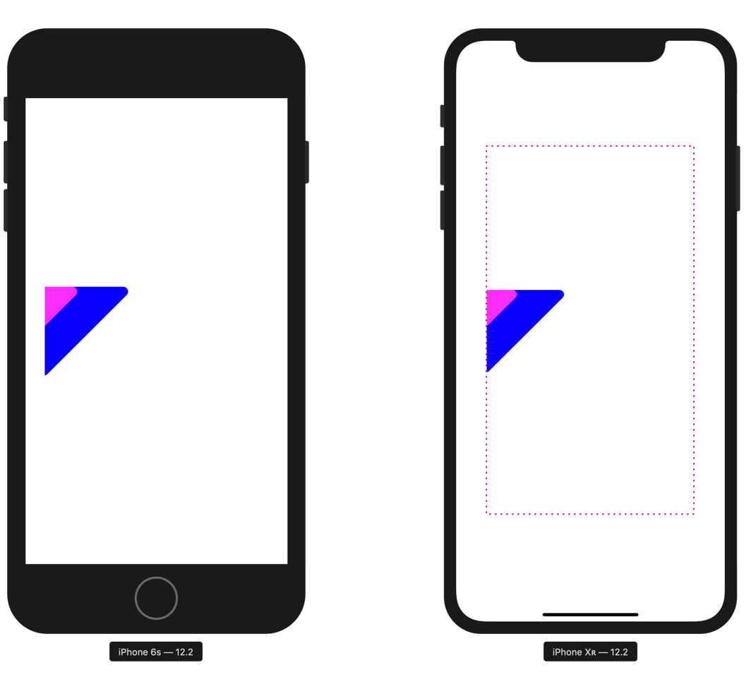
The size of the artboard is higlighted on the right.
Solid Backgrounds
If you design your launch animation with a background color, or a shape that fills the artboard, you will find that launching on larger screens may look something like this:
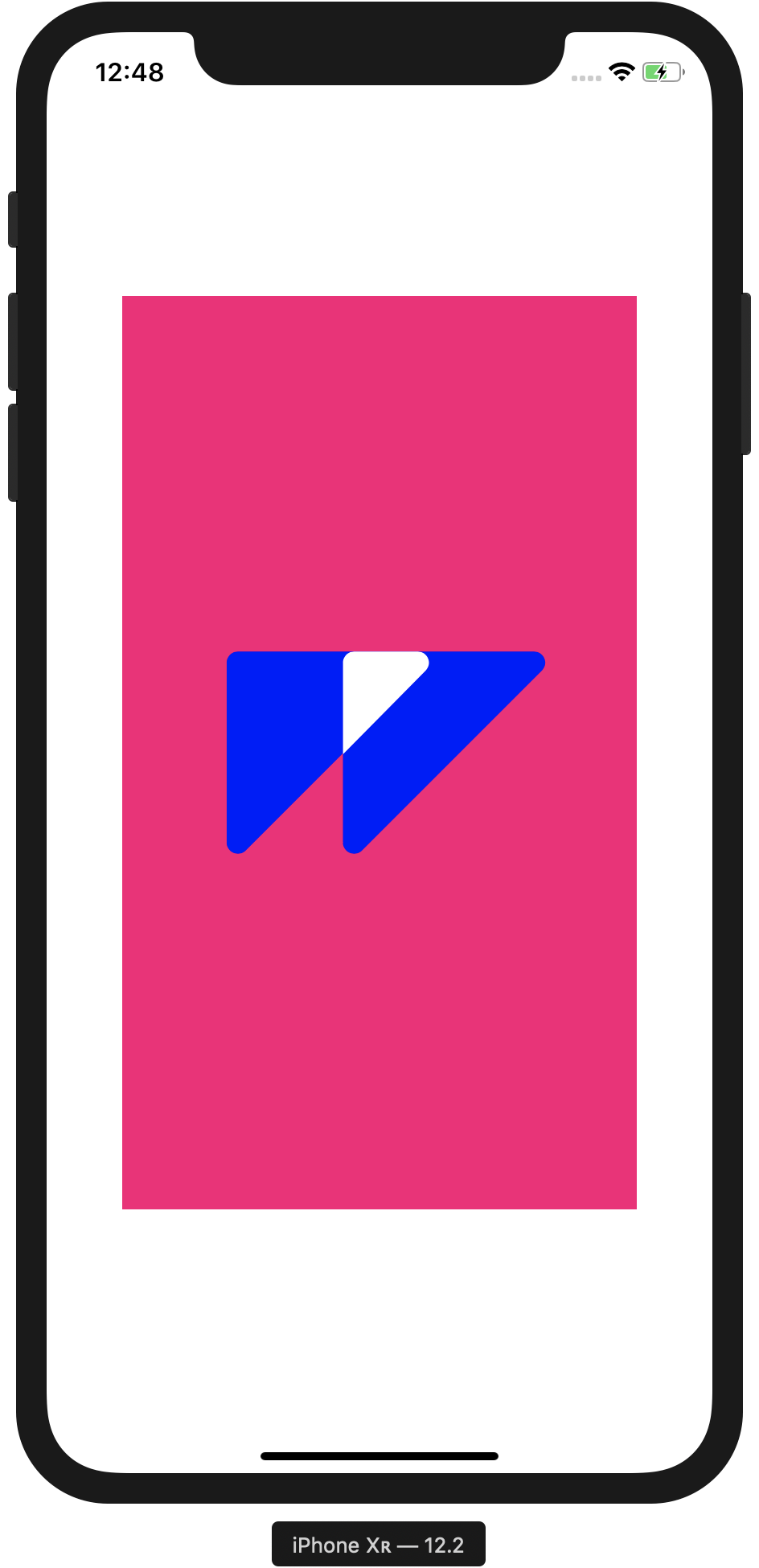
This is easily fixed in Xcode.
Follow these steps:
- In Xcode, select
main.storyboard - Select the main
viewof theScene View Controllerlayer - Change the background color of the view
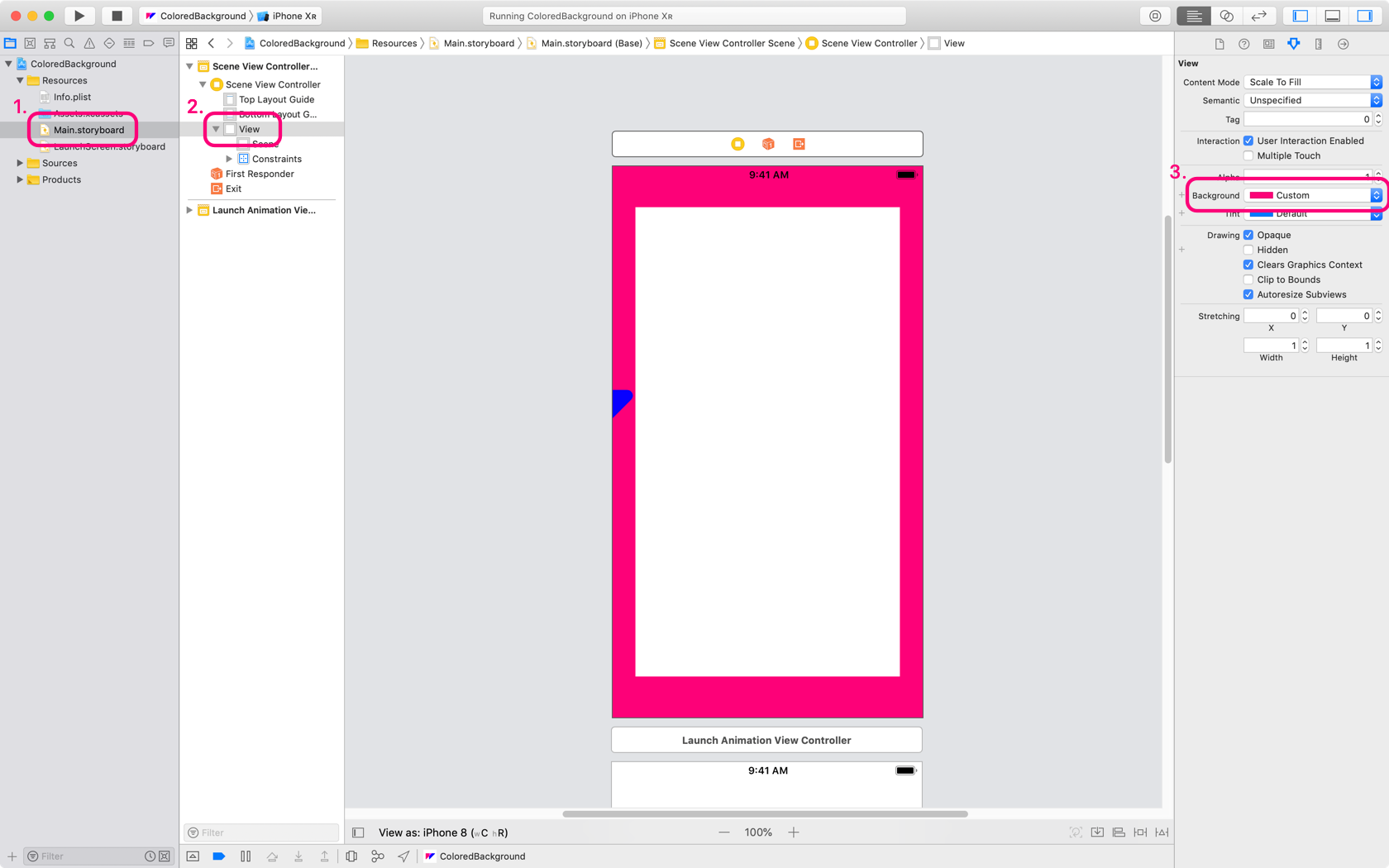
Now, your animation will be centered and the background color on any larger device will match your animation.
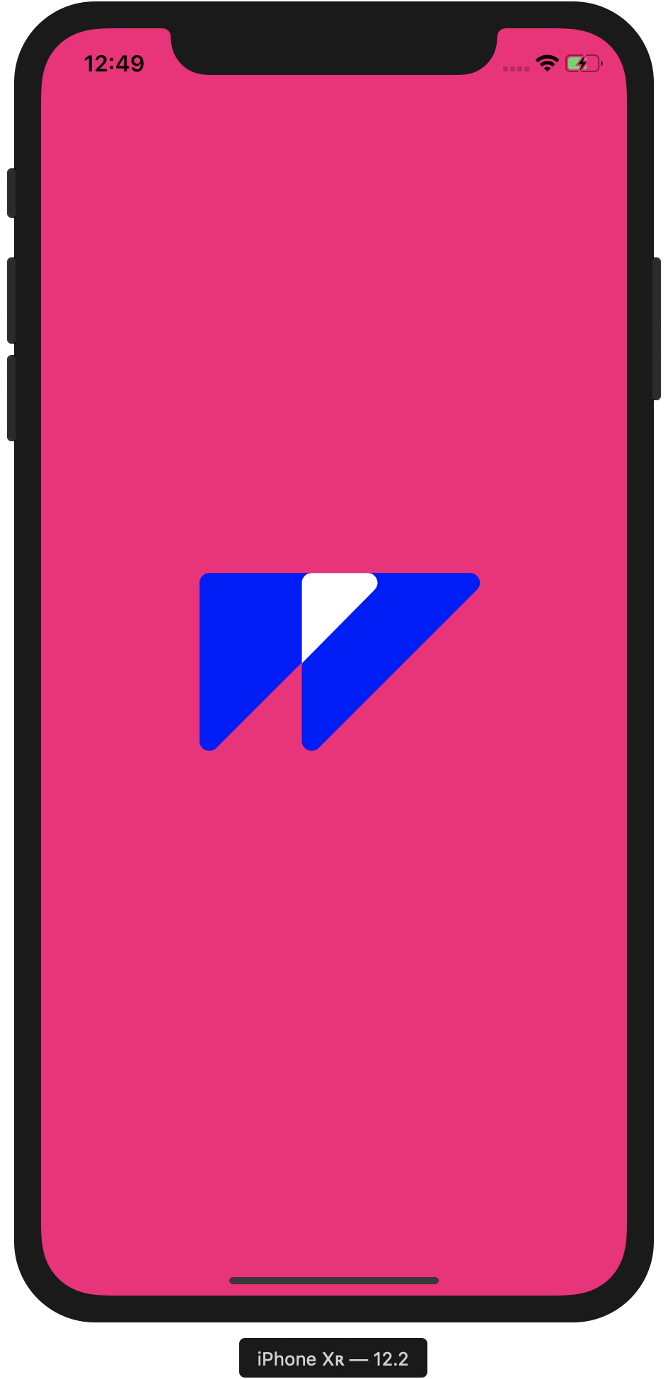
You could also export an animation with a clear background color and follow the same steps as above.
First Frame Content
Like the Evo example above, if the first frame of your animation has content, then you’ll need to sync this with the LaunchScreen.storyboard file included in your Xcode poject. This is fairly easy to do, and can be done in many ways.
Here’s how we did this for the Flow launch animation that comes with the standard iOS export option.

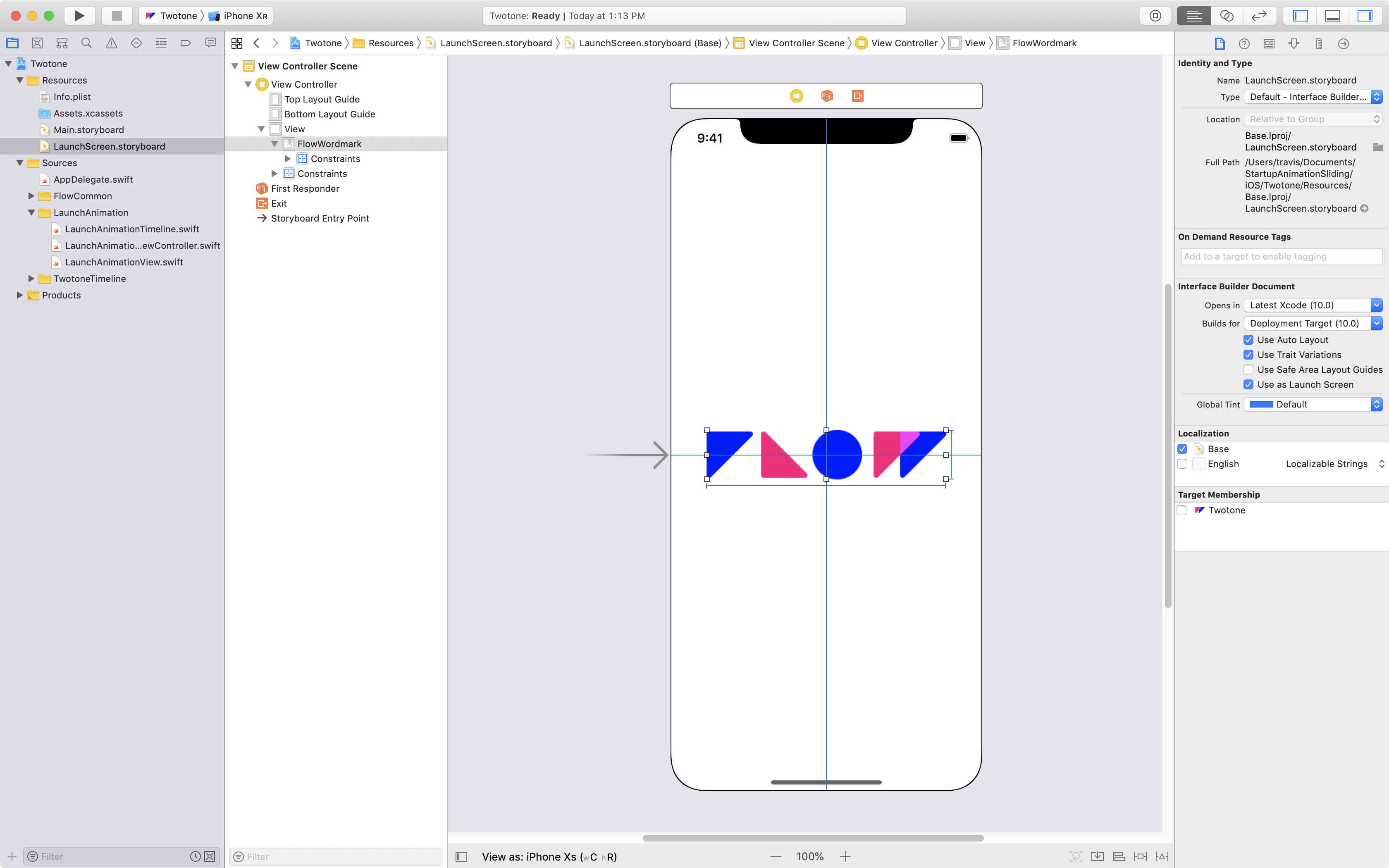
This actually takes a few more steps, so if you’re interested, then check out our tutorial on Creating A Launch Animation with Content on the First Frame.