HTML Export Structure
Our approach to HTML export uses CSS3 and SVG animations.
To get started, let’s look at a simple file with only a single shape on it.
You can also grab all the exported HTML files here:
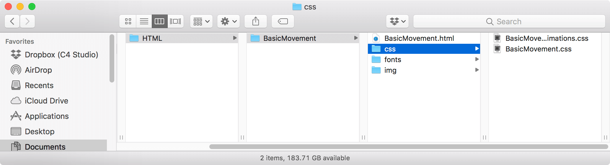
Structure
Flow exports the following file structure:
- An index.html
- A css file for initial styles
- A css file for animation keyframes
- A folder for images
- A folder for fonts
It looks like this:
No Movement
To get started, let’s look at a case where we have only a single shape that doesn’t animate.

Index
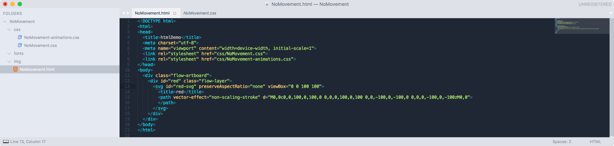
The output is standard, with basic links in the <head>.
The main thing to note in the <body> is this:
<body>
  <div class="flow-artboard">
    <div id="red" class="flow-layer">
      <svg id="red-svg" preserveAspectRatio="none" viewBox="0 0 100 100">
        <title>red</title>
        <path vector-effect="non-scaling-stroke" d="M0,0c0,0,100,0,100,0 0,0,0,100,0,100 0,0,-100,0,-100,0 0,0,0,-100,0,-100zM0,0">
        </path>
      </svg>
    </div>
  </div>
</body>
flow-artboard
The top-level div is a flow-artboard which has the styles and sizing of the main artboard on the stage.
<div class="flow-artboard">The main attributes are its position: absolute which puts the artboard at the top-left of the browser window, and overflow: hidden which clips all content that lies outside its view (i.e. Mask to Stage).
red
The next div is called red, which is the name of the layer in the flow file.
<div id="red" class="flow-layer">This div’s class is flow-layer which is a standard class from which all layers inherit basic styles.
red-svg
All shape layers will have an internal svg with a viewBox sized to the layer’s bounds.
<svg id="red-svg" preserveAspectRatio="none" viewBox="0 0 100 100">
	<title>red</title>
	<path vector-effect="non-scaling-stroke" d="M0,0c0,0,100,0,100,0 0,0,0,100,0,100 0,0,-100,0,-100,0 0,0,0,-100,0,-100zM0,0">
	</path>
</svg>
It also contains a <path> element that defines the shape in SVG code.
CSS
The style sheet for the initial layout of the timeline looks like this:
.flow-layer {
    position: absolute;
    overflow: visible;
    box-sizing: border-box;
    border-style: solid;
    border-width: 0px;
    animation-duration: 1s;
}

.flow-artboard {
    width: 375px;
    height: 375px;
    overflow: hidden;
    position: relative;
    padding: 0px;
    margin: 0px;
    background-color: #FFFFFF;
}

#red {
    width: 100px;
    height: 100px;
    left: 68px;
    top: 188px;
    transform: translate(-50%, -50%) rotate(0deg);
    box-shadow: 0px 0px 3px #00000000;
}

#red-svg {
    position: absolute;
    stroke: #9C004A;
    fill: #FD0178;
    stroke-miterlimit: 10;
    stroke-width: 10px;
}

path {
    fill-rule: evenodd;
}

svg {
   overflow: visible;
}
A few things to note:
- The
redlayer is positioned by its mid-point, and offset using a transform to mimic having an anchor point of{0.5, 0.5} - The
svgtag hasoverflow: visibleso that it doesn’t clip the edges of its stroke. - The
flow-layerdefines ananimation-durationof 1 second, which is equal to the length of the timeline in Flow.
Animation CSS
For this timeline, there is no code in the animation css file.
Basic Movement
The next timeline moves the shape from left to right.
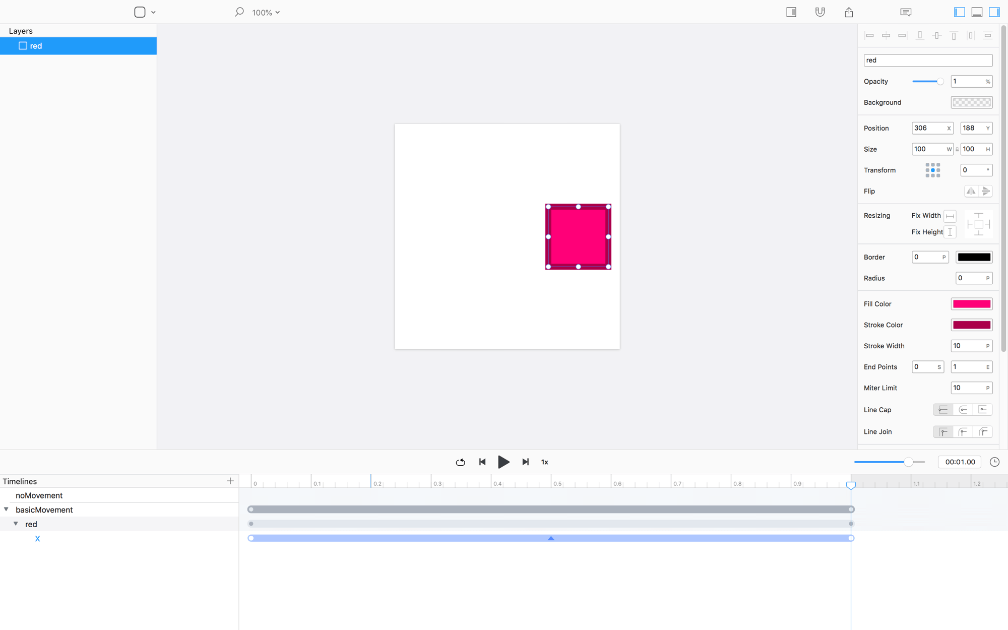
Try exporting the code for this timeline
After exporting, you’ll notice that the HTML and CSS files are basically the same.
CSS Differences
The only difference to the CSS file is the addition of these two lines:
#red {
	...
	animation: red-animation 1s ease-in-out 0s both;
}
#red-svg {
...
animation: red-svg-animation 1s ease-in-out 0s both;
}Animation CSS
The big difference is that the animation CSS file now has some code.
@keyframes red-animation {
    0% {
        left: 68px;
    }
    100% {
        left: 306px;
    }
}
Complex Animation
The third timeline in our document has a more complex animation.
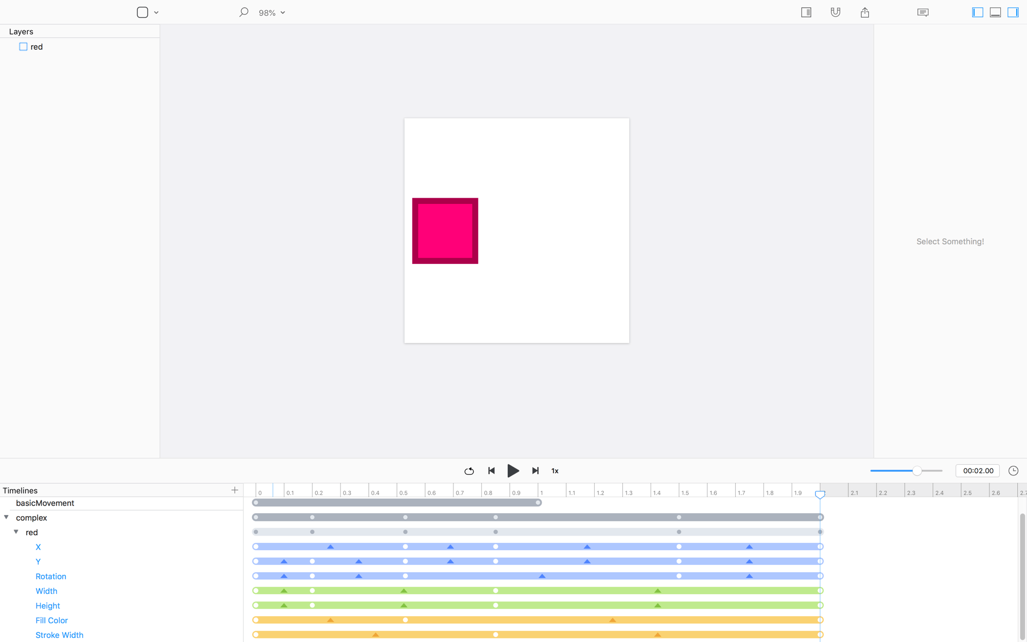
CSS / Index Differences
Even with the addition of keyvalues, the index and css files are identical to the basic movement timeline.
Animation CSS
There are more keyvalues in the animation file now:
@keyframes red-animation {
    0% {
        left: 68px;
        top: 188px;
        height: 100px;
        transform: translate(-50%, -50%) rotate(0deg);
        transform-origin: 50% 50%;
        width: 100px;
    }
    10% {
        top: 120.71px;
        transform: translate(-50%, -50%) rotate(45deg);
        transform-origin: 50% 50%;
        height: 159.13px;
        width: 159.13px;
    }
    26.5% {
        left: 184.23px;
        top: 216.17px;
        transform: translate(-50%, -50%) rotate(90deg);
        transform-origin: 50% 50%;
    }
    42.5% {
        left: 258.08px;
        top: 120.47px;
        height: 31.59px;
        width: 31.59px;
    }
    75% {
        transform: translate(-50%, -50%) rotate(180deg);
        transform-origin: 50% 50%;
        top: 296.66px;
        left: 294.34px;
    }
    100% {
        width: 100px;
        transform: translate(-50%, -50%) rotate(0deg);
        transform-origin: 50% 50%;
        height: 100px;
        top: 188px;
        left: 68px;
    }
}

@keyframes red-svg-animation {
    0% {
        stroke-width: 10px;
        fill: #FD0178;
    }
    10% {
    }
    26.5% {
        fill: #2062FF;
    }
    42.5% {
        stroke-width: 20px;
    }
    75% {
    }
    100% {
        fill: #FD0178;
        stroke-width: 10px;
    }
}
Recap
There’s a boatload of ways we could do HTML export, this is just one of them. That said, this mix of CSS3 and SVG/SMIL animations is pretty tight across both Safari and Chrome.
The implementation is light and relatively easy to work with.
P.S. Chrome is better. Way better. At rendering HTML animations. ❤︎