Setup Your Sketch File Hierarchies For Animation
Automagic. This happens when you load two artboards into a new Flow project and it makes an animation from all the differences between them. To get this work might take a little bit of ❤︎ if you’re not already used to preparing your artboards.
There’s one crucial element this automagic needs in order to happen:
The artboard hierarchies need to be identical
We’ve put together a simple hierarchies.sketch file that this doc will walk you through:
What Works
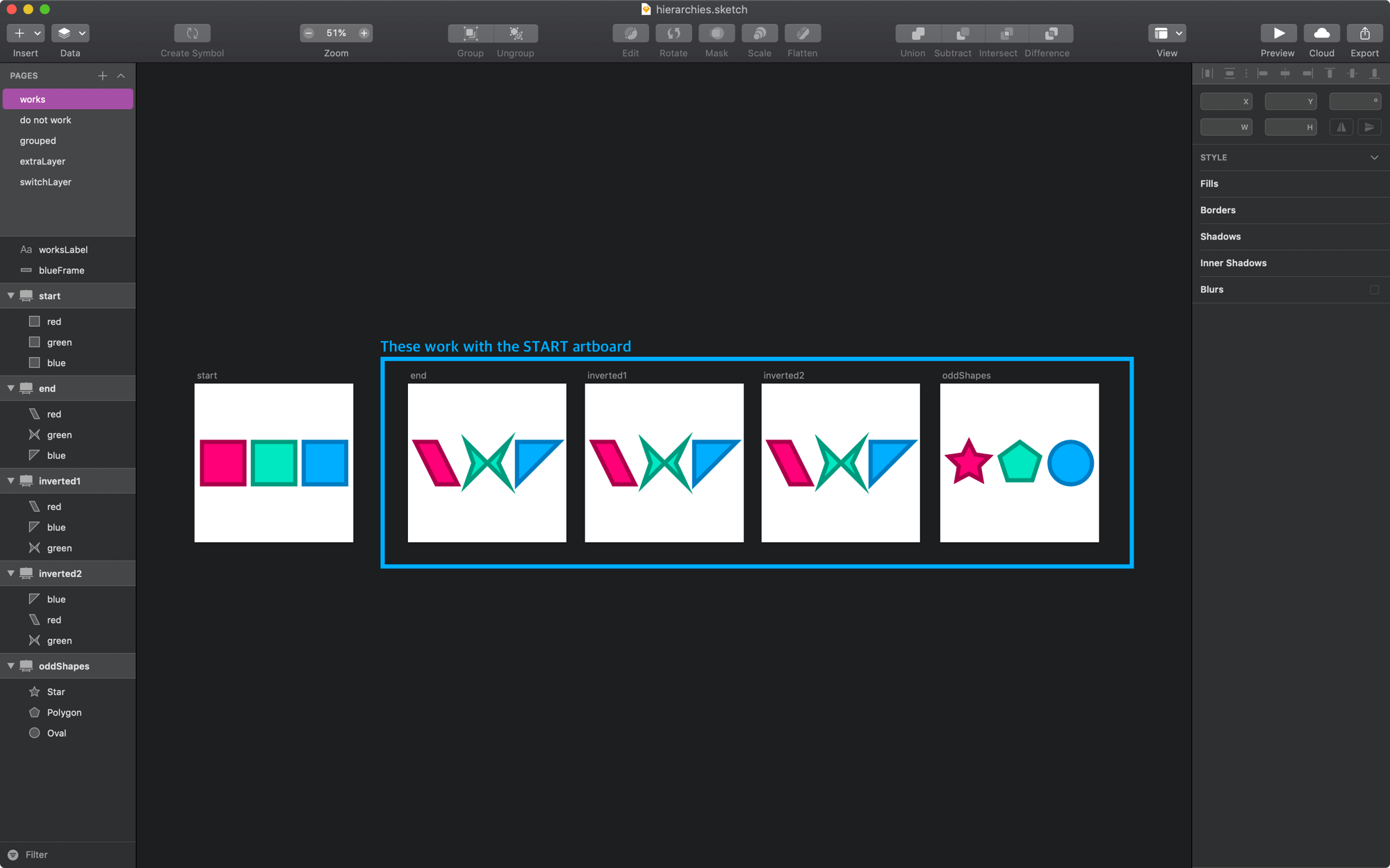
On the works page you’ll see a start artboard, and 5 others that can be animated. If you look at their hierarchies, they are:
- all shapes and,
- all ungrouped

end
The end artboard is a copy from the intro.sketch file that comes with Flow. The only difference with this one is the paths of the shapes on the artboard.

inverted1
This example shows inverting 2 layers.

inverted3
All the layers have been switched around in this artboard.

oddShapes
You can even change the shapes of paths. This artboard actually uses a visually identical start artboard (i.e. startOdd) to keep the orientation of points betwen shapes tidy.

If you plan to do some custom shape transitions, then you should check out our doc on creating path animations.
What Doesn’t Work
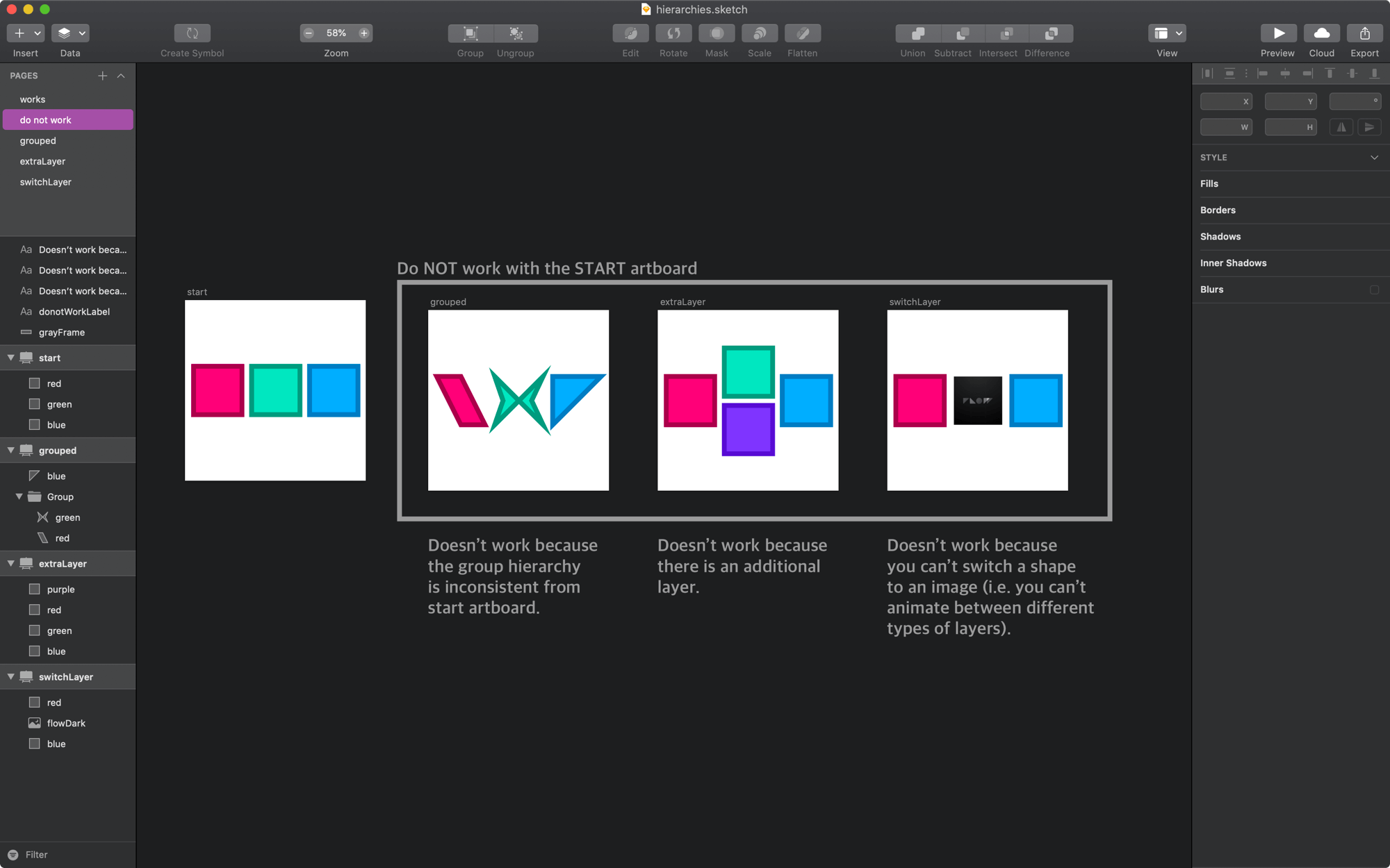
When two artboards do not have the same hierarchy, and by this we mean the same structure and the same types of assets for each layer.

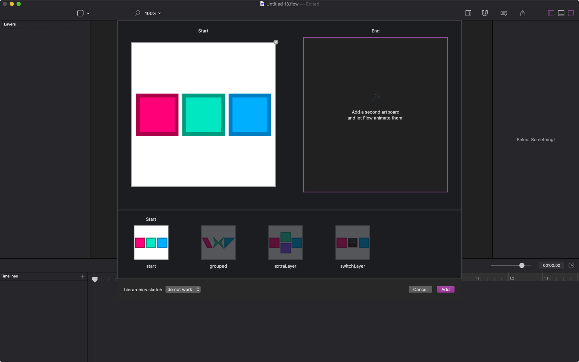
And, when you try to load these in Flow, you’ll see that the options are all greyed out.

HRM… WHYYY?
The main reason is that we can’t just guess what you’re intending to do with your animations.
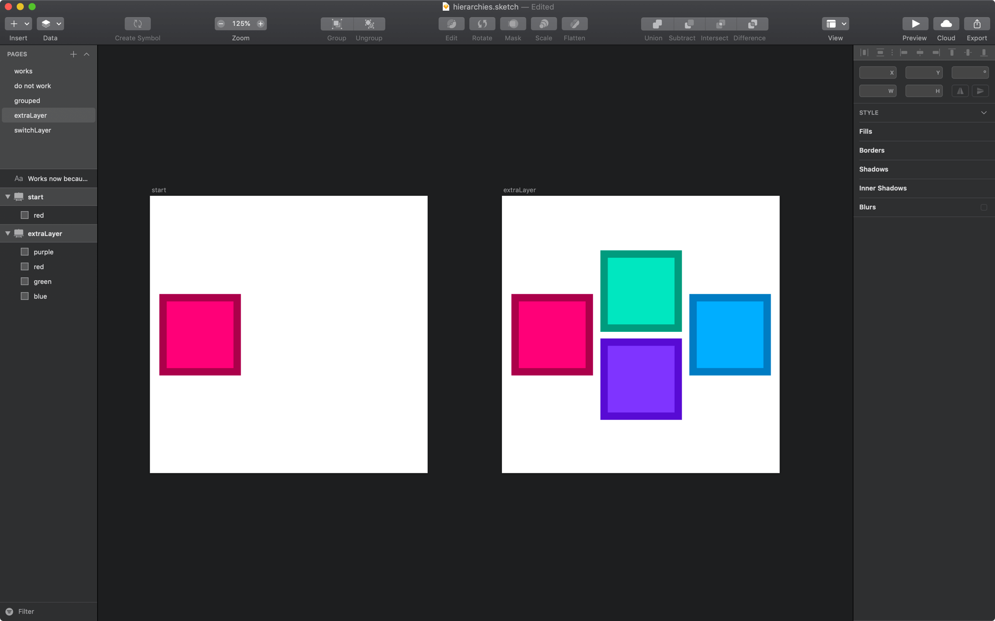
Let’s say you have two artboards with different hierarchies like the ones below:

You may expect Flow to automatically:

or…

or…

Flow could just guess which of those possibilities you intended, but it would probably be wrong 99% of the time. We’re good, but we don’t believe in ESP.
Be Explicit
It’s always best if you’re explicit in your intention to animate elements. Instead of guessing what you intend to do, we ask you to do a little bit of prep to make sure your artboards are structured the right way so that we can work our automagic.
But I Want to Transition Between Screens!
Got it. Yes. I understand. And, this is typically the main reason for animating between disparate artboards. Now, transitioning between screens is a very different beast (code-wise) than simply creating an animation.
So, it wouldn’t be really trustworthy of us to say:
“Animate two artboards and give that to your developer”
Because they’d come back to you and say:
“That doesn’t make any sense to do it that way.”
Transitions are Structurally Different
The reason for this is that during a transition the developer is actually going to use 2 completely different views with different layouts, and it’s a pain to custom animate between separate view controllers.
In any production setting, animations will always be self-contained within the same view / UI component. I can’t think of a single time where 1 animation bridges multiple view controllers. If it did, then it would be made up of more than one animation working together to look like a single composition.
Okay, But I still Want to Animate Between Artboards
Alright, if you want to do this you’ll have to do a bit of copy/paste wizardry. Here’s how I construct a combo start / end animatable artboard using two designs in our TravelApp.sketch file.
VID: TravelApp.sketch second page, with our new UI.
When coding up an animation, all the views need to be in place at the beginning. So, if you end up copying / pasting so that all your views exist on both artboards, then you’re starting to think through how the entire lifecycle of your designs will look in production.