Learning to Animate By Stealing Other People’s Work
・Travis
Our take on the art of finding design inspiration, picking it apart, rebuilding and owning your own creative expression.
I love being a part of the Dribbble community. There are so many amazing designers creating new concepts, products and aesthetics. Every day I get to see something fresh, something new, something interesting, but what I really like is when designers rebound other people’s work. A rebound is “a shot in response to another shot” they’re an awesome feature that have been around for about 10 years.
There are 3 main reasons I really like rebounds.
Rebound to Learn
The first, best reason to rebound is to learn. In this, I fully agree with Michael Abehsera’s great article: The Art of Stealing: How to Become a Master Designer. In it he breaks down how to think differently about being inspired by other people’s work:
Instead of looking at other designers’ work with envy, think of it as the key to your success.
He introduces a parallel between Github and Dribbble, and talks about how being inspired to recreate another designer’s work is like forking code.
Dribbble’s rebound feature is the closest thing we have in the design industry to GitHub’s “forking,” or downloading any piece of open source software and making it your own.
He takes a broad look at rebounds in the Dribbble community, and uses 10 really interesting shots to support his position. In the end, he concludes:
When you copy someone else’s design work, you have to pick it apart in order to understand it and apply it… Copying effectively teaches you to do it the right way.
Can you, as a designer, look at a static image and decompose it into the techniques, styles, and layers that you need to recreate it? For me, I really like to do this same practice but for animations.
Rebound to Homage
It often takes a lot to create a rebound because you’re analyzing a static image, looking at its various elements, picking apart the techniques and layering, then rebuilding it from your own perspective and experience. That’s a lot of dedication, so when you do this and repost your work, it’s like an homage to the original designer – a tip of the hat – a recognition of great originality – a desire to honour that creativity.
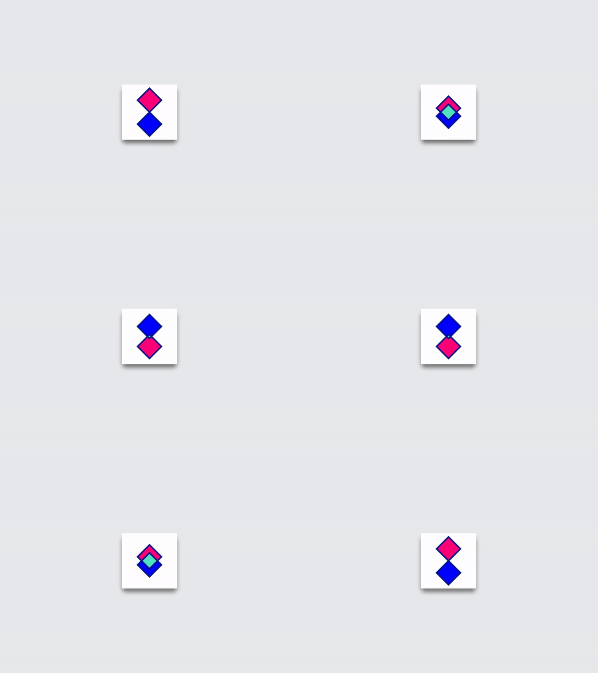
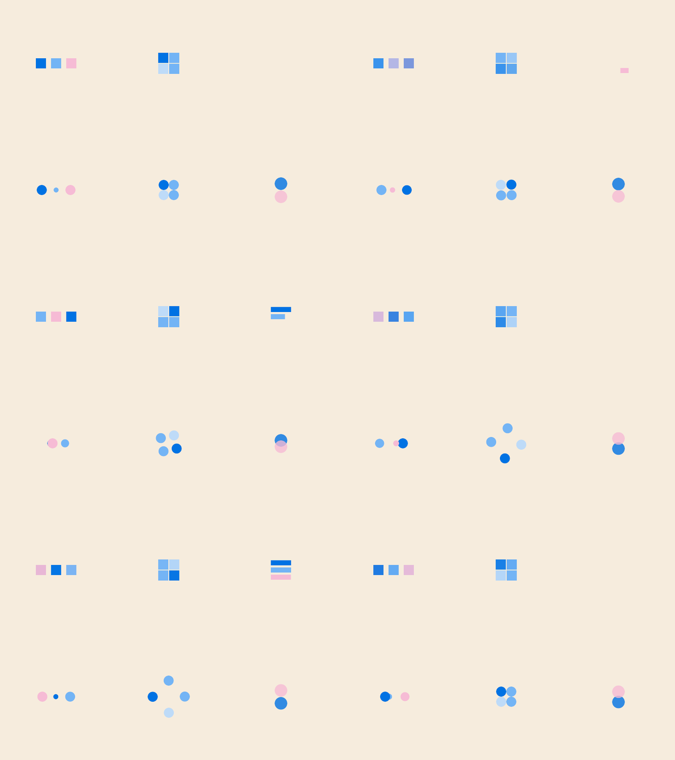
Here are few of my rebounds.
Gridlock
Here’s Gridlock, an animation with a cool visual effect, it looks like each of the squares makes its way around the design by sliding – right, down, left, up. It was based on one of the animations in Unusual Animated Loaders by Margarita Ivanchikova – L, F, S. Her portfolio shows a really great breadth of style, and I really like a lot of her posts. So, I was compelled to recreate this piece. The neat thing about it is that there’s only 4 actual slides then everything repeats – so it’s a bit of a visual trick.
Stretch Around
Recreating Stretch Around required figuring out how to create the looping effect, as well as deciphering the layering that gives the aesthetic of a line stretching with a thick border. It was inspired by Loader XLVII, a micro animation experiment by Oleg Frolov – W, T, I, G, B, L. Oleg’s work is a bastion of design ideas and creative experimentation, all grounded in cutting-edge aesthetics.
Can you see that each of the dots is actually 2 lines, and that there are 8 total shapes animating?
Reflect
This one, which I call Reflect, was more of an inspired idea than a direct rebound. Inspired by on one of the animations in Daily UI #76 by Namika Hamasaki – W, T, G, M, L. Namika’s style is elegant, to say the least. In her original piece, I saw the two circles overlapping and realized I wanted to create a similar effect using a masked layer to reveal the green, and I also wanted to create a bit of a pop mid-way through the animation.
From time to time I’ll dive into an new category of animations, round up some awesome inspirations and see if I can unpack, rebuild, and recreate them. I like this process a lot because I learn, and I get really inspired by the amazing work that’s out there.
Rebound to Challenge
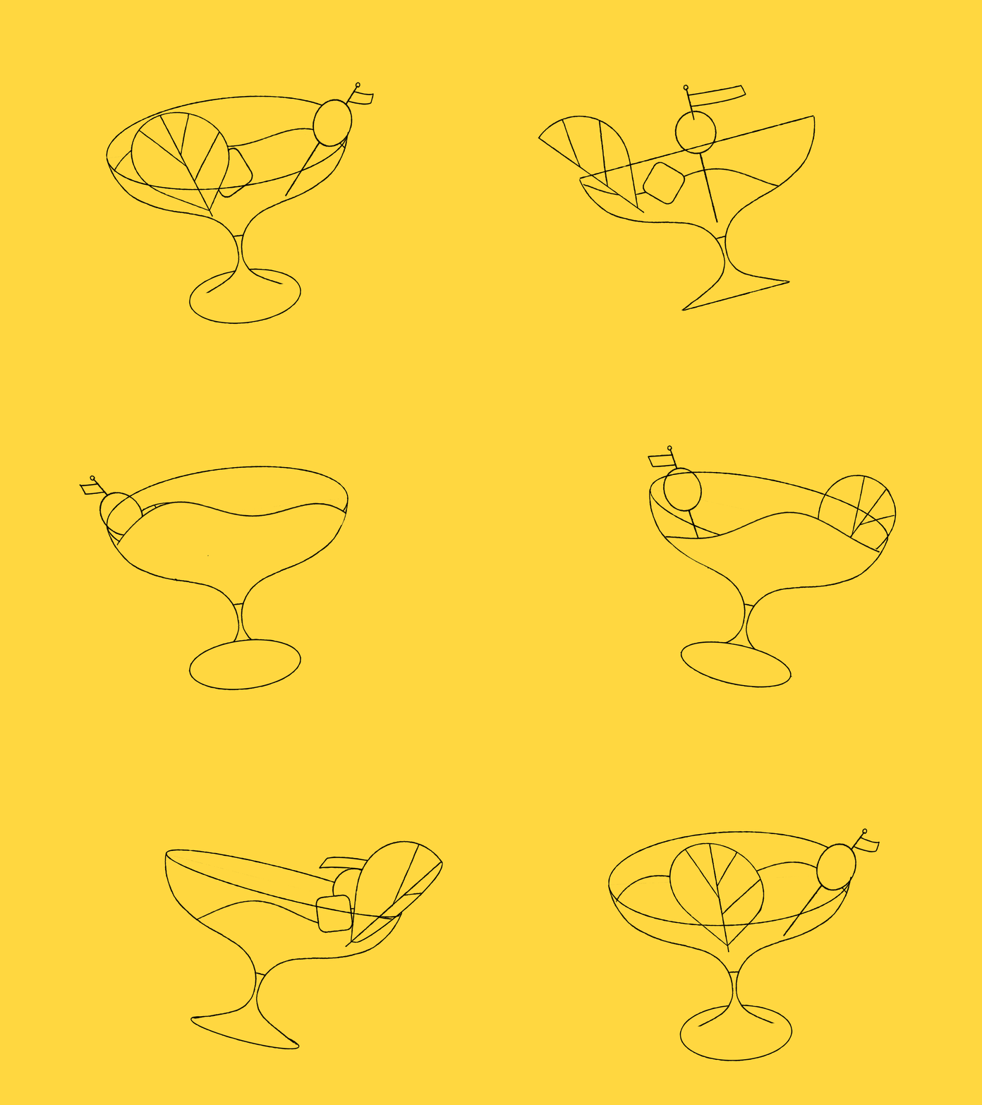
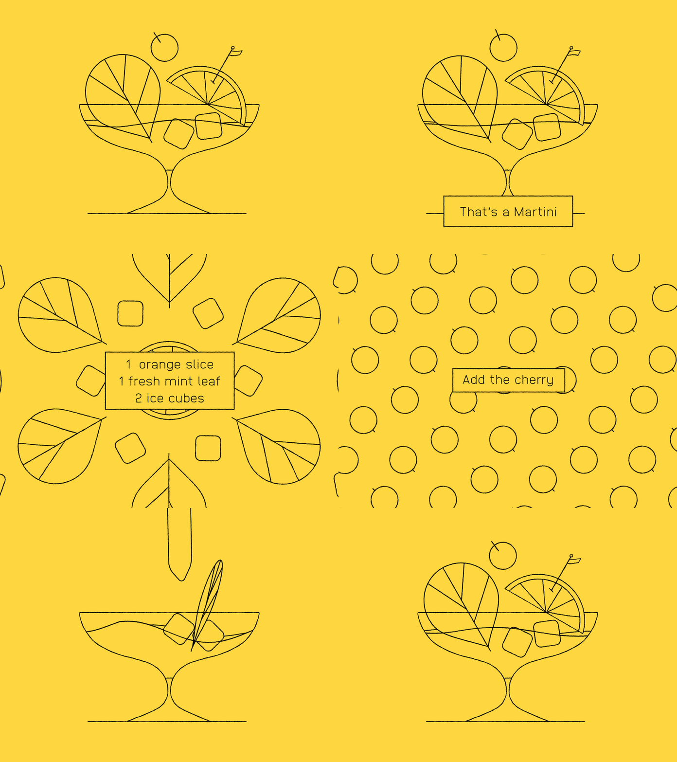
Challenges are a awesome way to engage with the community. Back in May, Loris F. Alessandria – W, I, B, V – shared an interesting design and threw down the Martini 🍸Animation Challenge! for people to animate it. In doing so he gave away his design file, and in return there were a bunch of people from all over the world who brought it to life.
The original illustration looks like this:
In the next week and a half, 5 designers from 5 different countries around the world rebounded original animations using Loris’ illustration.
This kind of thing is just awesome to see.
Steal, Own, Credit, Give Back
The rebound is probably one of Dribbble’s best features, and was really forward-thinking when it came out. I fully believe in using rebounds for learning, paying homage, and challenging other people to create beautiful work. I highly recommend you take up the practice, through which you will discover new aesthetics, learn new techniques, promote great work, and hopefully push others to do the same.
Own your creative expression, even if it’s riffing off of someone else’s original work.
Remember though, it’s all about crediting people for their originality, creativity, process and talent.
Don’t just steal. That’s a dick move.


